


TASK
Development of the new logo and corporate design.
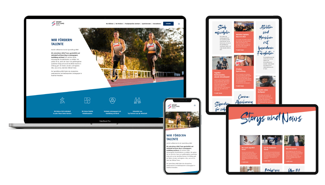
The Sportstiftung NRW supports athletes in becoming outstanding personalities on their way in competitive sports, education and career and thus enables perspectives. They are partners of Olympic, Paralympic and Deaflympic athletes and drivers of innovation for competitive sports in North Rhine-Westphalia. In this sense, they are the largest initiative of any federal state in Germany.
Since 2018, they have turned their focus from coaches to athletes. These should be reflected in the new, fresh branding. Since employees of the foundation wanted to edit materials themselves in the future, the design had to be easy to use. Athletic achievement is something very individual and has its own „signature.“
DERIVATION OF THE LOGO
Sport is motivating, powerful, dynamic, passionate, inspiring, challenging, goal-oriented, ambitious, self-confident, fresh, youthful, diverse, colorful, solitary, inclusive, a we-feeling, fair togetherness and the will to perform.
The symbolism of the abstract „S“ unites all of this. The three ribbons winding around each other symbolize:
// Community – Team Sportstiftung NRW consists of many athletes and solidarity-based sponsors. Success is the result of teamwork.
// An upwardly striving running track composed of three evenly ascending individual tracks. They symbolize the coexistence of competitive sports, education & career as well as an accompanying sponsoring partner.
// A dynamically ascending, sweeping vortex. Top performance requires the ability to constantly reorient and motivate oneself for success.
// Medal ribbons – One goal is the individual greatest possible sporting success.
Translated with www.DeepL.com/Translator (free version)
…………………………..
AUFGABE
Entwicklung des neuen Logo und Corporate Designs.
Die Sportstiftung NRW unterstützt Athletinnen und Athleten dabei, auf ihrem Weg in Leistungssport, Ausbildung und Beruf herausragende Persönlichkeiten zu werden und ermöglicht damit Perspektiven. Sie sind Partner olympischer, paralympischer und deaflympischer Sportler*innen und Innovationstreiber für den Leistungssport in Nordrhein-Westfalen. In diesem Sinne sind sie deutschlandweit die größte Initiative eines Bundeslandes.
Seit 2018 haben sie ihren Fokus statt auf die Trainer auf die Athleten gerichtet. Diese sollten sich im neuen, frischen Branding wiederfinden. Da Mitarbeiter der Stiftung in Zukunft Materialien selbst bearbeiten wollten, musste das Design einfach zu handhaben sein. Sportliche Leistung ist etwas sehr individuelle Leistung und hat eine eigenen „Handschrift“.
HERLEITUNG DES LOGOS
Sport ist …
… motivierend, kraftvoll, dynamisch, leidenschaftlich, begeisternd, herausfordernd, zielorientiert, ehrgeizig, selbstbewusst, frisch, jugendlich, vielfältig, bunt, solidarisch, inklusiv, ein Wir-Gefühl, faires Miteinander und Leistungswille.
Die Symbolik des abstrahierten „S“ vereint all das. Die drei sich umeinander windenden Bänder symbolisieren:
// Gemeinschaft – Das Team Sportstiftung NRW besteht aus vielen Athlet*innen und solidarischen Förderern. Gelingen ist das Ergebnis von Teamwork.
// Eine aufwärtsstrebende Laufbahn, die sich aus drei gleichmäßig hinaufführenden Einzelbahnen zusammensetzt. Sie symbolisieren das Nebeneinander von Leistungssport, Ausbildung & Beruf sowie einem begleitenden Förderpartner.
// Einen dynamisch aufsteigenden, mitreißenden Wirbel. Spitzenleistungen setzt die Fähigkeit voraus, sich immer wieder neu zu orientieren und für den Erfolg zu motivieren.
// Medaillenbänder – Ein Ziel ist der individuell größtmögliche sportliche Erfolg.